The Stats Guy: Why I love population pyramids, but never use them
Our resident Stats Guy explores the myriad tales a population pyramid can tell, as well as its drawbacks.

If you want to explore population data, if you think about demographics – it’s probably a population pyramid that you are intuitively visualising.
Today I will explain why population pyramids are great and why I nonetheless never, ever use them in my presentations.
What is a population pyramid?
It’s a simple enough graphic.
On one side are the blokes, on the other the sheilas, with age groups stacked from youngest at the bottom to oldest up top.
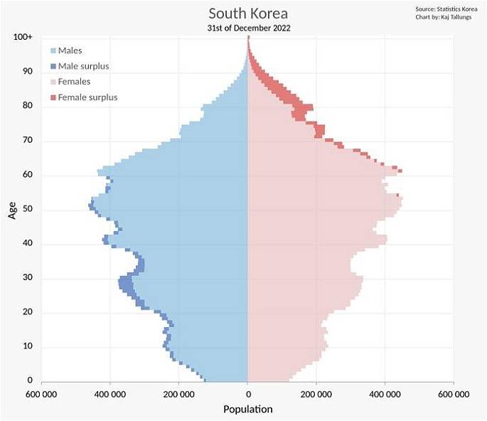
Sometimes the shading shows if there is a surplus of men or women for each year of age, as in this example of South Korea.
The shape of the population pyramid tells us plenty. A broad base? That means lots of kids, a sign of a young, growing community.
A bulge in the middle? You’re looking at a working-age boom. A top-heavy pyramid? That’s the mark of an ageing population, with more seniors than juniors.
Sometimes it’s the gaps that tell scary stories of wars or pandemics. A sudden surge in numbers? That’s a baby boom (if at the bottom of the pyramid) or a change in migration policy (if first occurring in the middle of the pyramid).
You might like


Interpreting a population pyramid is like reading a topographic map – the contours give you clues about the past, present, and even the future.
That’s why, whether you’re planning services or trying to project future market movements, this visual remains the go-to for anyone keen on making sense of population data.
Animating a population pyramid over decades allows us to see the transformation of a country.
In 1950 Italy’s population pyramid really looked like a pyramid with few old people on top and heaps of young people on the bottom.
In 1950, Italy had nowhere near enough jobs to offer to all these young people. Therefore, young Italians emigrated to Germany, the US and, of course, Australia.
It’s due to Italy’s population pyramid in the 1950s that we enjoy great coffee today in Australia. Italy today (2025) is home to 12 million more people than in 1950, but records less than half the births.
The reason we aren’t importing young Italians anymore has nothing to do with Australians disliking Italians – there are just no young Italians left to import to Australia anymore.
By 2100, Italy will resemble a slim doner kebab and will have lost 24 million residents (about one Australia) compared to today.
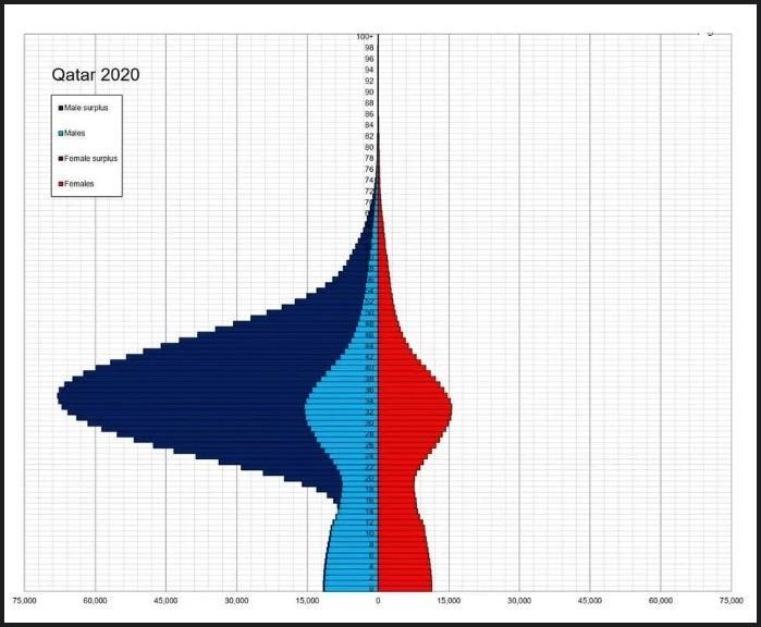
Sometimes a population pyramid hides interesting gender data. The most famous example is Qatar. The nation imports hordes of male foreign construction workers to build infrastructure and dwellings in the desert. The result is the world’s most lopsided population pyramid.
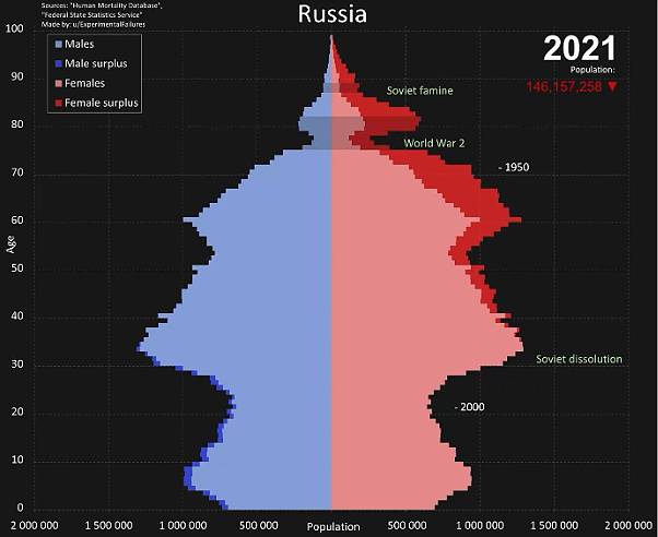
Russia also has a bizarre population pyramid. The chart shows the cruel effect of the Second World War and the economic collapse following the fall of the USSR.
We also see second order effects from insane alcohol abuse that keeps killing Russian males prematurely, leading to a huge female surplus in the upper half of the visual.
As this data is only from 2021, casualties from the war with Ukraine and associated lower childbirth rates will only exacerbate this demographic disaster in the future.
Stay informed, daily
By now, you will have realised how much information can be packed into a humble population pyramid and why it’s such a beloved visual among demographers. I still owe you an explanation to why I never use them in my presentations.
My first problem with population pyramids is that they are more suited to portrait rather than landscape mode. When I am presenting on stage about demographic data, visuals in landscape mode better fill the screen and look more pleasing.
The second reason is that, in Australia, the population pyramid doesn’t reveal a major gender story.
Talking to an Australian audience about Australian population data, it is sufficient to talk about the total population – no need to develop a male/female narrative separately.
Showing an audience two data points (male and female) while talking only about one (total population) is confusing and wastes time on stage.
As a public speaker or writer, you only have a few seconds to explain to an audience what the visual on screen means.
There is also a philosophical problem I have with population pyramids. When we think about time, when we think about life, we think in linear terms.
Life starts at the left and moves to the right side of the chart until we die. Just as we read a sentence from the left to the right, we visualise our life as starting on the left and ending somewhere on the right. That’s also how we design project timelines for example.
It’s not intuitive to us to view aging as occurring from the bottom to the top as is the case in a population pyramid.
That’s why I prefer a simplified version of a population pyramid.
There is usually no gender story worth telling with Australian population data, so I show data only for the total population. This reduces visual clutter by 50 per cent – nice!
We then flip the chart by 90 degrees. This means our graphic now sits in landscape mode rather than portrait – much more suitable for those big screens at the conferences that I present at.
In such an area-line chart combo (that’s what Microsoft Excel calls such a chart) I also find it much easier to see the population changes. It’s so easy to see that population in their 40s sees a big boom for example.
In a gendered chart you need to look at male and female population in their 40s to check that both sexes grow – too much effort.
It takes a bit of editorial courage to limit the data displayed but it allows for a faster and more intuitive analysis.
I will therefore happily enjoy population pyramids in the privacy of my office but publicly I will use the simplified visual.
Simon Kuestenmacher is a co-founder of The Demographics Group. His columns, media commentary and public speaking focus on current socio-demographic trends and how these impact Australia. His podcast, Demographics Decoded, explores the world through the demographic lens. Follow Simon on Twitter (X), Facebook, or LinkedIn.
Want to see more stories from InDaily Qld in your Google search results?
- Click here to set InDaily Qld as a preferred source.
- Tick the box next to "InDaily Qld". That's it.


